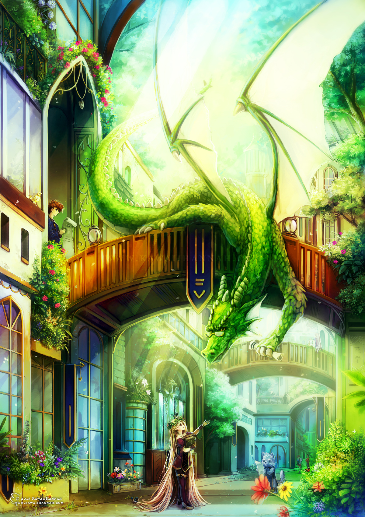
Dragon University Walkthrough
It’s been a while since I made a CG tutorial and I’ve changed the way I colour quite drastically since the last one. This one won’t be as in depth as the last tutorial, because it requires you to know basic Photoshop skills and such, but hopefully it should give some insight into my workflow ^_^ This was entirely drawn in Photoshop, using my Wacom Intuos 4 tablet.
Brainstorming
So, to begin this picture, I had a basic description of the dragon, that was generated at Seventh Sanctum. The dragon was to be green, helpful to non-draconic races and has a hoard of maps/documents. I think it also had something about a friendly city, but I can’t quite remember XD
I started by scribbling some thumbnails, to get some ideas flowing. These are usually quite messy to begin with and get more refined as I decide on general composition and perspective. They’re also tiny XD Sometimes if I like a thumbnail enough, I’ll blow it up and trace it, to make sure I keep the composition/proportions the same.
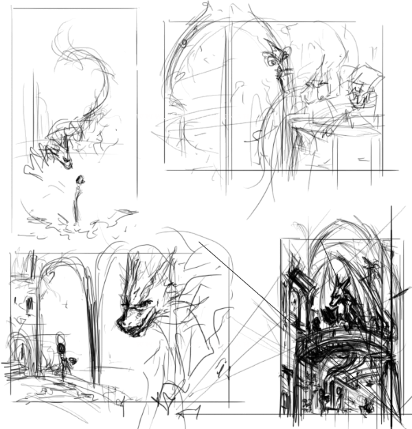
The first thumbnail doesn’t even have a background, but it has the kind of shapes and structure I like. I wanted the dragon to appear a little intimidating, but friendly XD
The second thumbnail has the dragon inside a library (with his documents/maps), with a door on the left, showing more of the library.
Third, the dragon is outside a “window”, where he can talk to the girl/give her a document. I liked this idea, but decided I wanted a vertical picture, to emphasize the dragons length and give the city some height.
And so the fourth thumbnail. I made the horizon line lower, so the viewer would be looking upwards. Started thinking about how the overall picture would look and the kinds of shapes within it. I also decided I wanted a bridge in there. Yay, bridges!
Final Thumbnail
I did some more sketching over the fourth thumbnail, so I would have a clear idea of where things would go and any trouble areas.

You can see in this instance, the dragon is sitting on the bridge, reading a book to a girl who sitting on the side of the bridge. I liked this idea initially, but later, I thought it left too much empty space at the bottom, so I moved the girl and changed the dragon’s pose.
I also considered having cathedral ceiling shapes towards the top, but I scrapped that, in favour of more fantasy-like buildings and lots of trees.
Sketch and Lines
With the thumbnail done, I copy it into a new document and resize it so it’s A4 at 300dpi. The thumbnail looks terrible being resized to that, but I can see what’s happening, so it’s ok XD
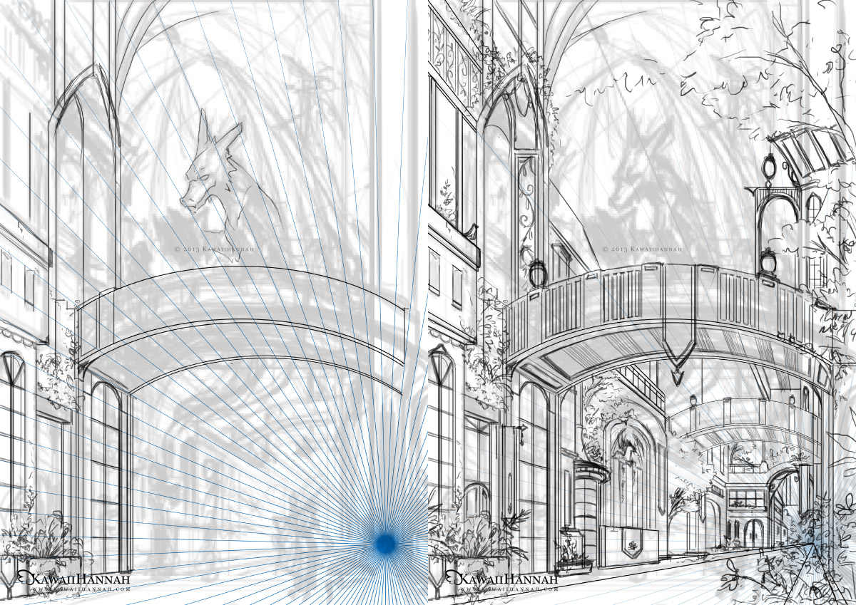
On a new layer, I add a blue perspective ray (because the picture is 1 point perspective). On another layer above that, I start drawing over the sketch, to create the line art. Because I’m going to paint this, I don’t bother being extremely clean with the lines.
In case you’re wondering how the building lines are so straight, I turned off tablet pressure sensitivity and used a really thin brush for those XD Click, hold down shift and click again to join the points! ^^
This is the finished background “line art”. It looks tidy when it’s that small, but it’s actually pretty messy.
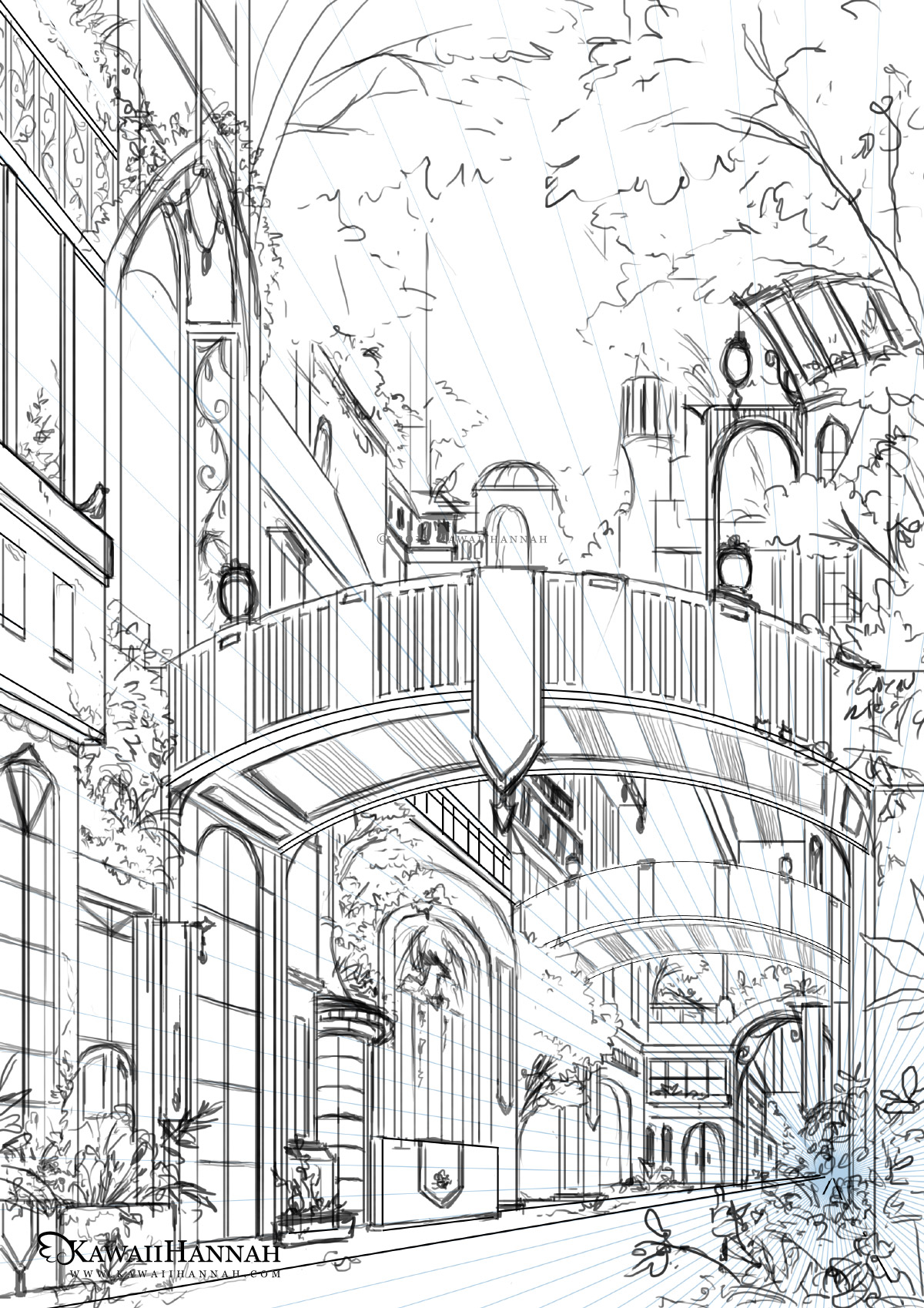
The foliage areas are mostly scribbles at this point. I just wanted to get the basic shapes of leaves, or “more important” flowers scribbled in.
When I paint later, I try to use those scribbles for the flower compositions. For example, the taller ones on the left, become lilies and foxgloves. The ones on the right at the front get a daisy like shape.
Characters
It was here that I decided to change the pose and structure of the girl and the dragon. It should really have been done at the thumbnail stage, but at least I haven’t started colouring! XD
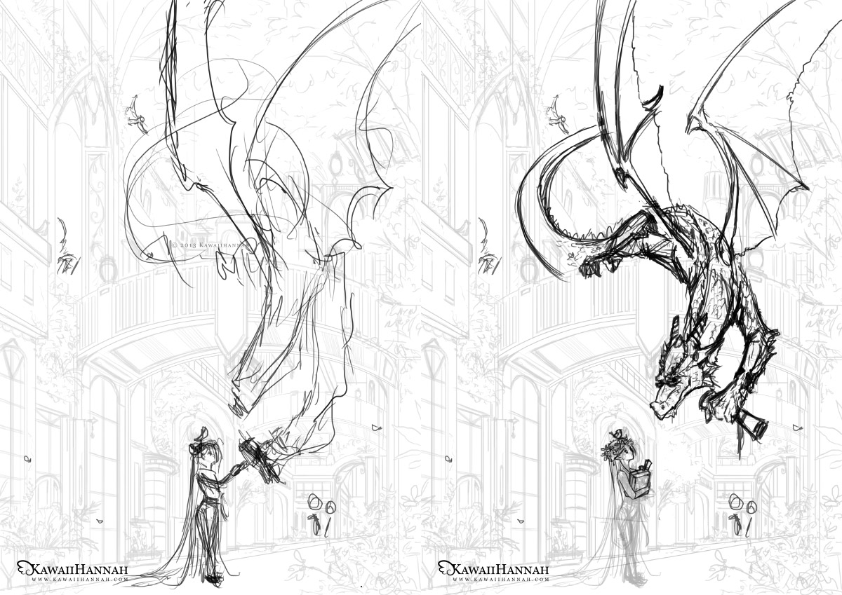
The first sketch is very messy, but it gets the pose idea across. The girl is too big for the setting, so I know I’ll have to resize her and the dragon’s arm stretches too far for my liking XP
The second sketch is just refined. I’m happy with the style/shape of the dragon’s head and the pose for the girl.
If you’re wondering what the other random blobs around are, they’re details I was considering.
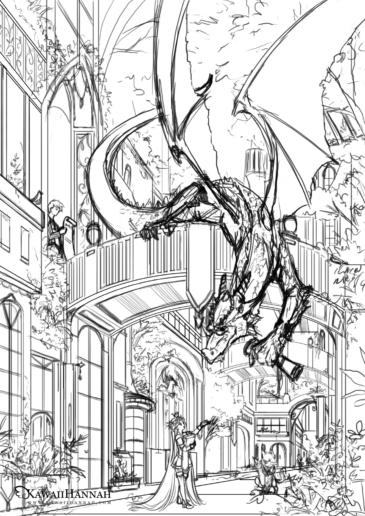
Changed the background layer back to 100% opacity and checked the placement of the characters. I also resized the girl, so that she would fit better in the scene and designed her outfit.
The other random blobs have now been turned into characters. There’s a guy on the bridge, coming through a door way and a large cat, walking on two legs towards the girl.
Values
This is something I started doing last year, which made CGing much, much faster. I filled the background with a mid-to-light grey and set the line art to Multiply.
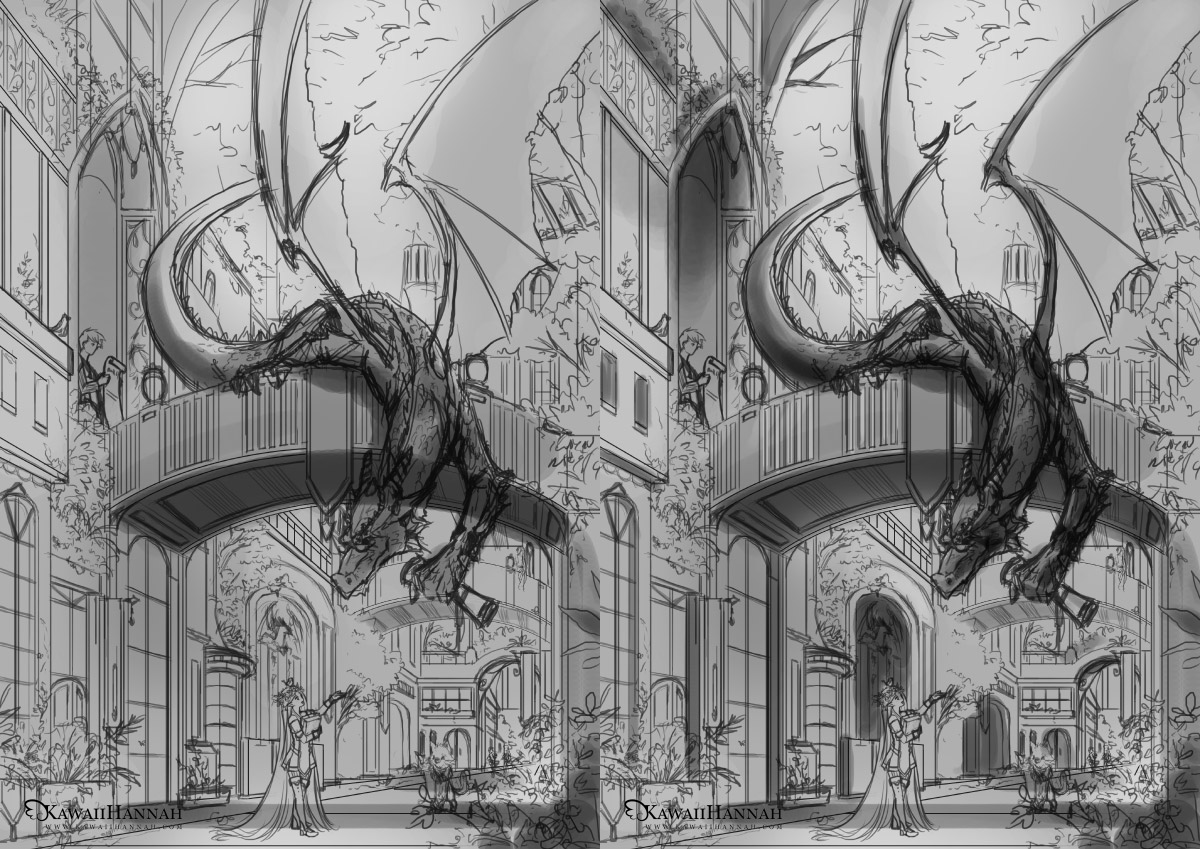
I begun by figuring out where the main shadows would be cast. The bridge was the obvious first one and then I moved to the dragon XD After that, I slowly moved around the background, making the inset areas darker and refining parts of the dragon.
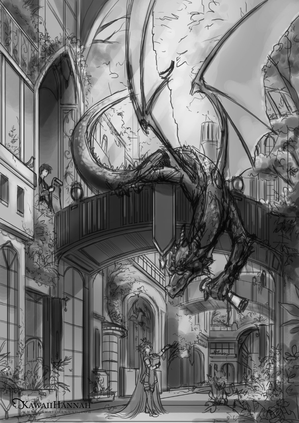
To the left is the finished value sketch.
I added light, from the top right, which brightened the sky area. I also adjusted the contrast of the other areas, so that some of the grey areas became darker.
It’s a little bit messy in places, but I can differentiate the areas enough, so that rendering will tidy it up. Not sure why I forgot to the do the girl in the front, as well as the cat, considering the guy on the bridge was done o_o
Overlaying Colours
This section mostly uses Photoshop layer styles, such as Overlay, Soft Light, Screen, Colour, Multiply. I often use a mix of these.
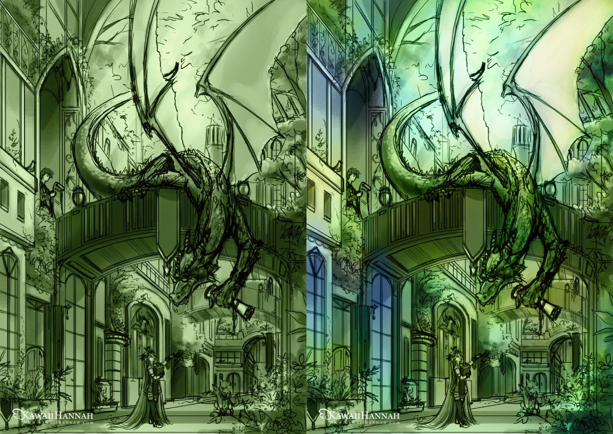
To start with, I added a “Colour” layer and filled it with green, because I wanted the whole picture to have a green undertone.
Then I added splashes of blue, with some yellow light towards the top, using “Soft Light” and “Overlay” layers.
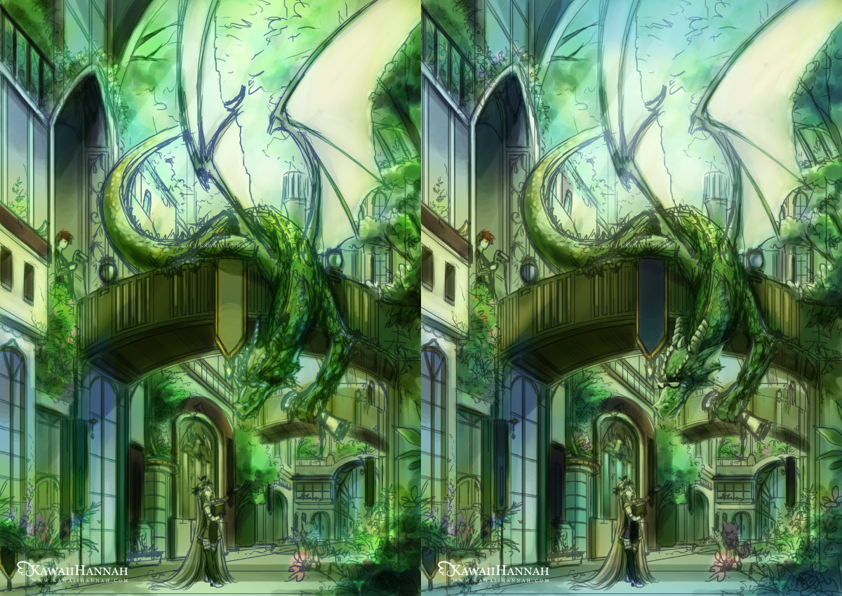
More colour layers! XD In the first image, I changed the lines to blue, so I could see more of the colours. In the next, I changed it again, to a darker green. I began doing parts of the dragon’s head too, because I was happy with how the colours were progressing.
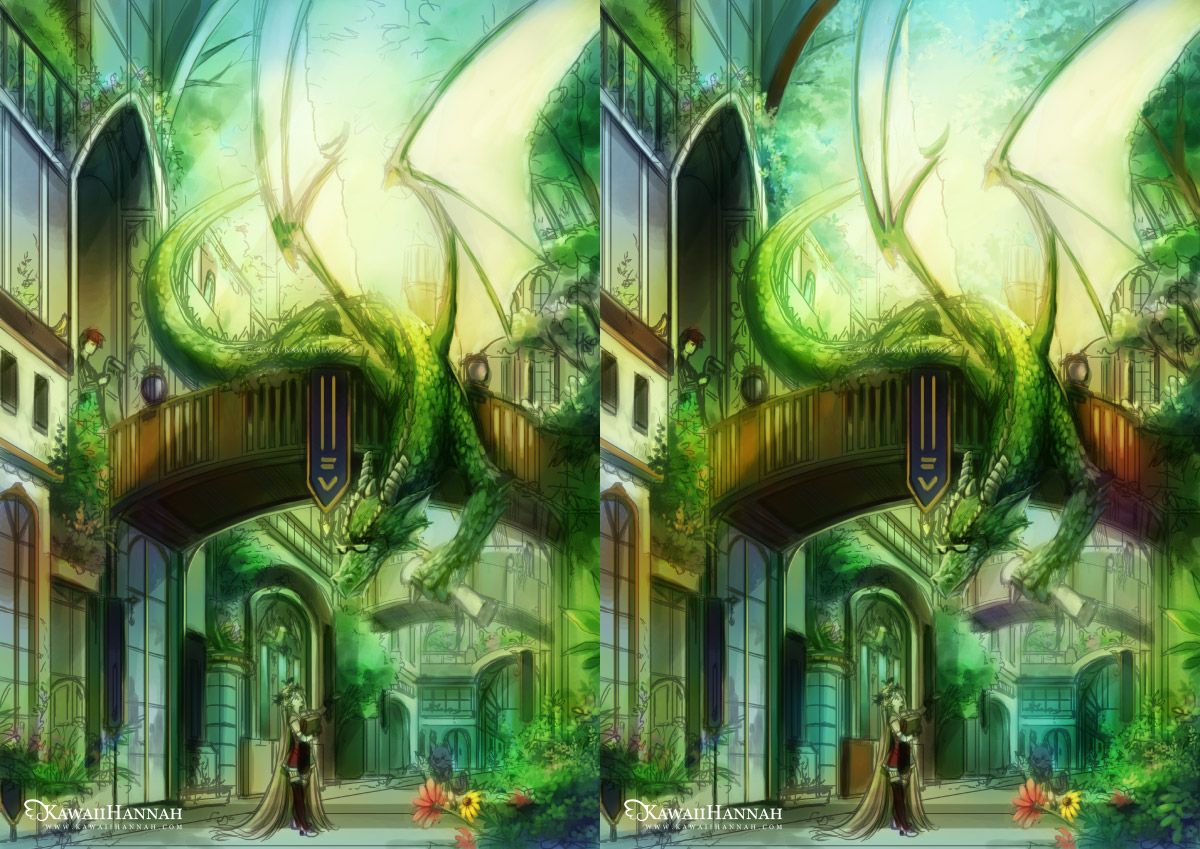
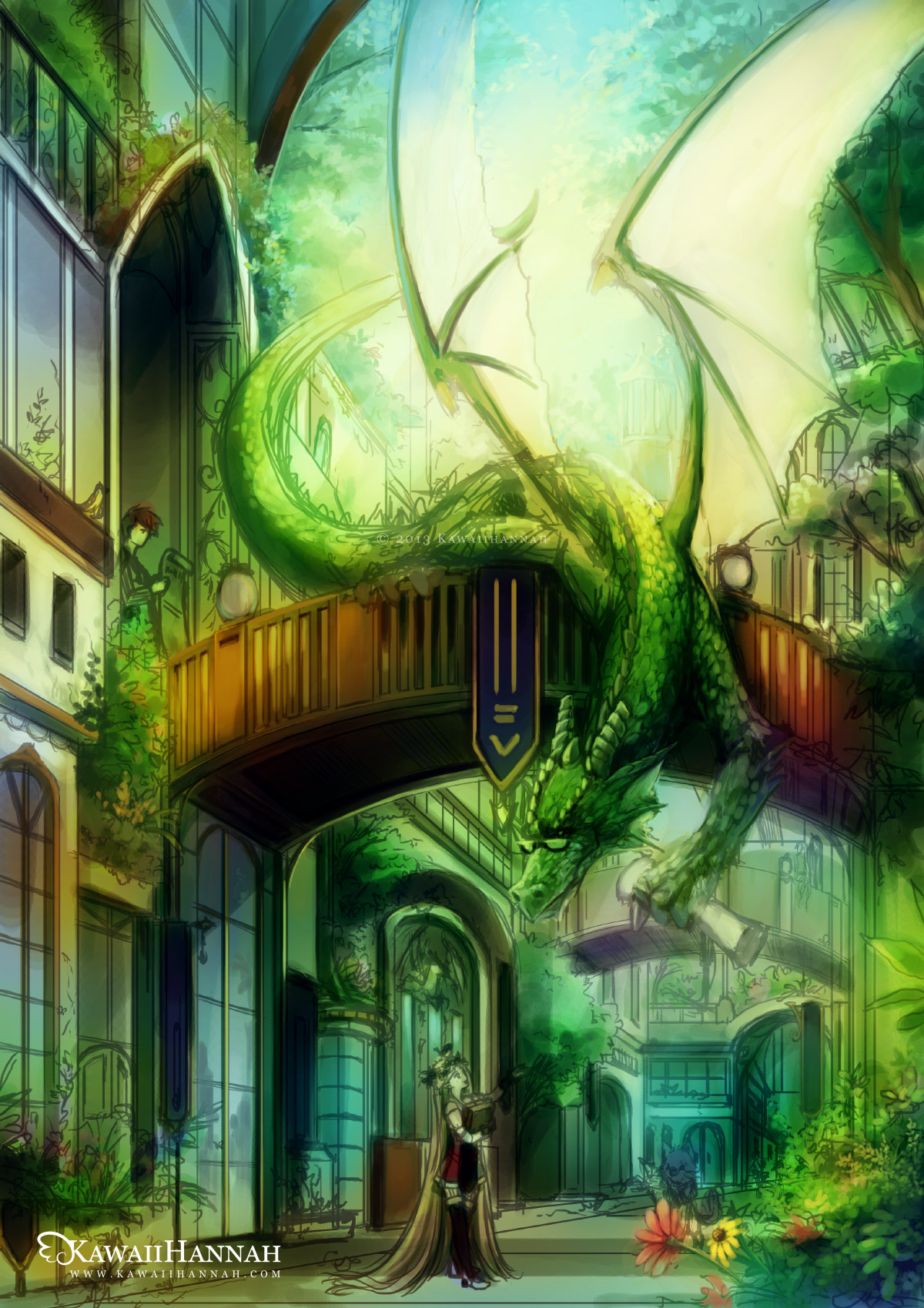
Added a giant yellow/orange overlay layer, to warm the whole scene up. Also darkened some colours and added a few spot colours to indicate flowers.
I’m really happy with the colours now. It’s got the atmosphere I want to achieve and I can see how the colours will progress later.
Here I also changed part of the dragons wing, where the bones would be, because I thought they didn’t match the opposite wing very well.
Rendering
This will be a very long section XD Mostly made of pictures. I don’t think I’ll be able to show every detail, but I’ll try to pick some different ones, so you can see the process of them ^_^
Rose Bushes
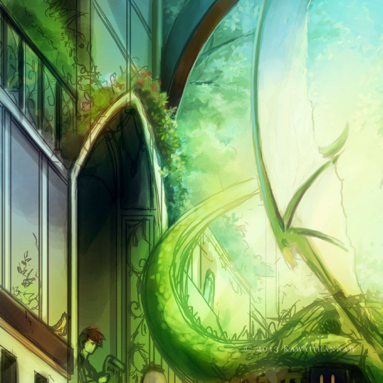

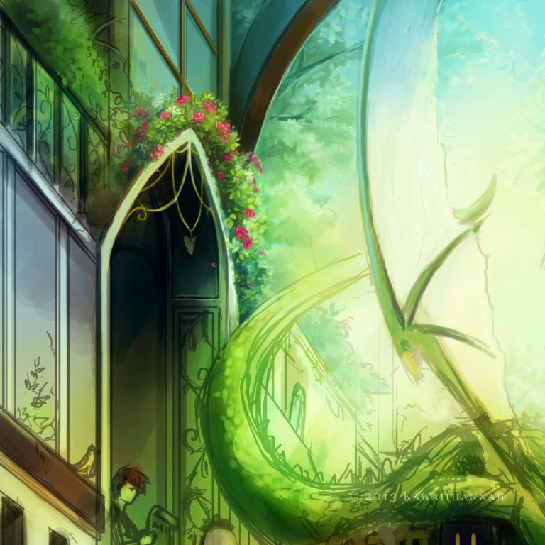
I added some blue tones to some of the underside areas of the leaves and used yellow towards the outside, where it might get hit by lots of sunlight. To draw the roses, I effectively just drew a swirl shape, highlighted the edges, then added a couple of petals on the outside XD
Boy
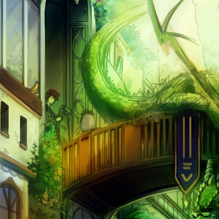


I tend to dart around a bit when rendering, depending on what I feel like working on at the time XP So the guy is left only partly done for now.
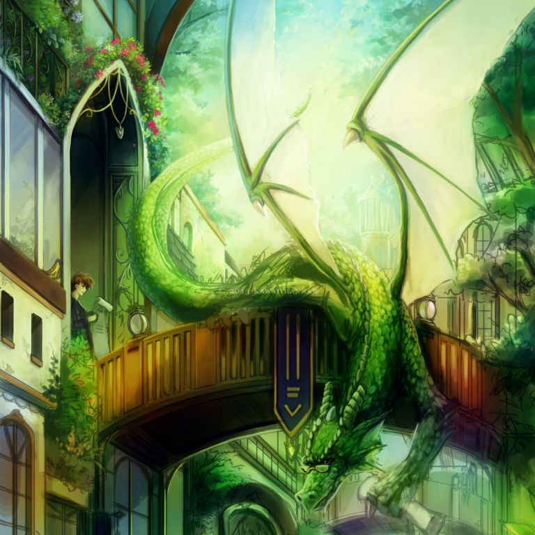
Dragon
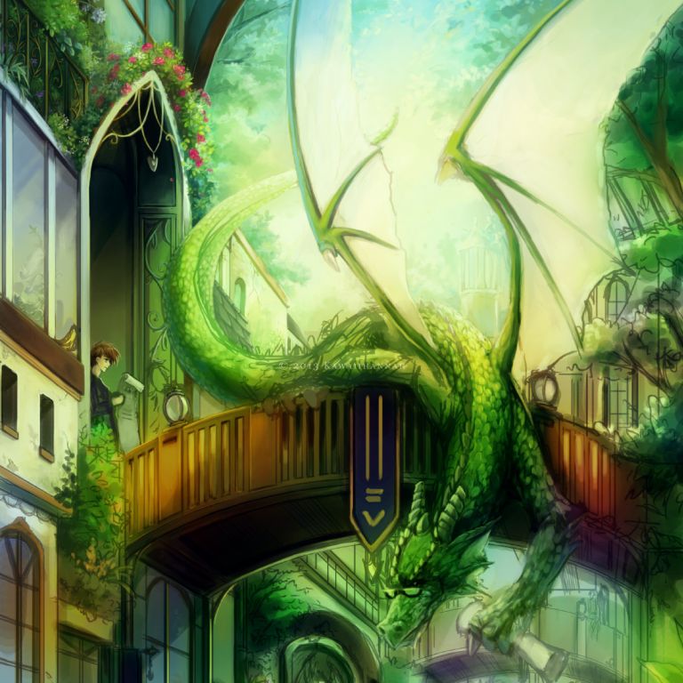


Flowers
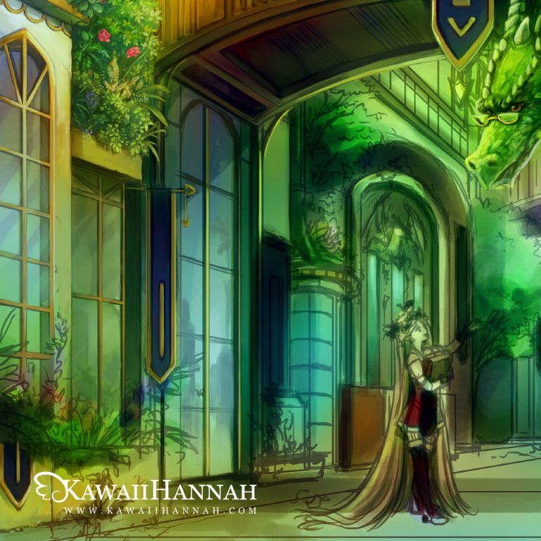
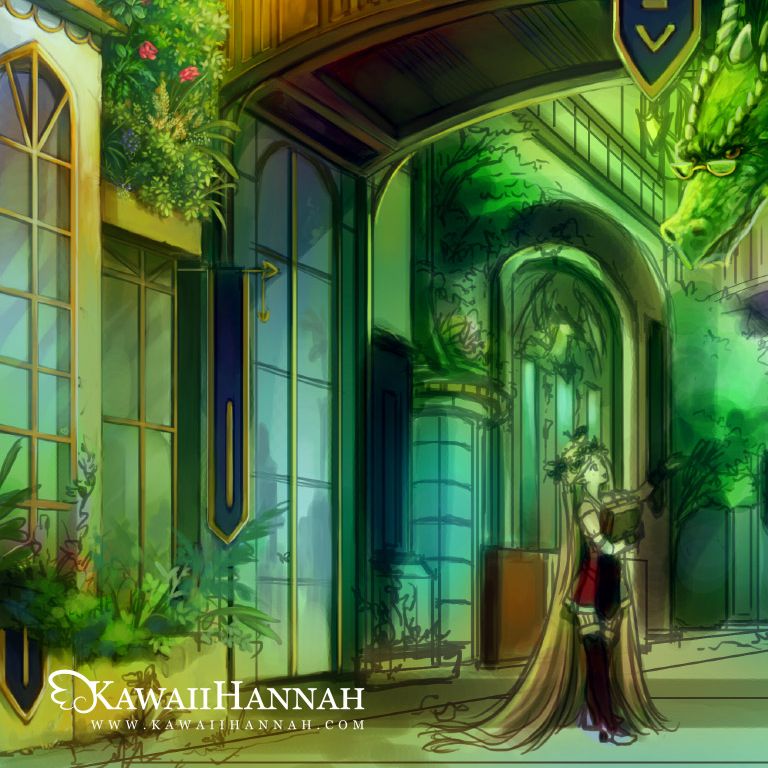
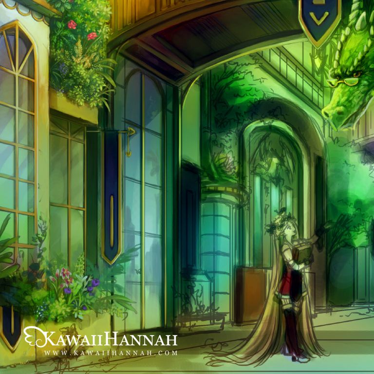
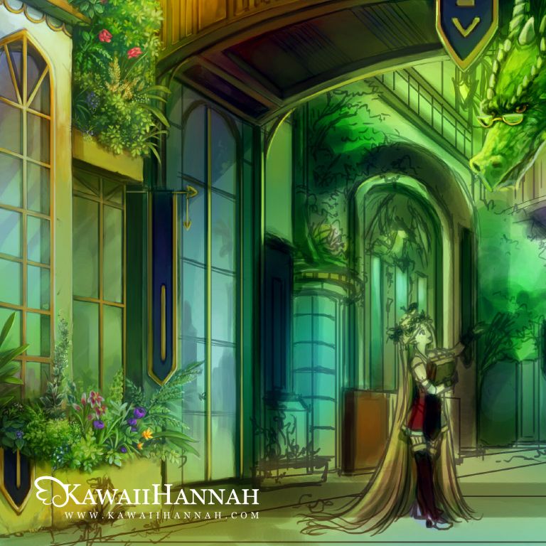

I’ve done my best to maintain the sorts of shapes that the sketch provided.I’m not sure some flowers make much sense, but I tried to use several I remember as a kid, checking photo references, if I knew the name of the flower (such as the daffodil and foxgloves).Most of the definition for the shapes of the flowers comes through the highlights.
With the different shaped leaves, there’s only about 4 types I used, as well as some varying shades of green (some more blue, some darker, some more yellow in tone). But I think it helps to break the monotony of just using one type of leaf ^_^
Archway
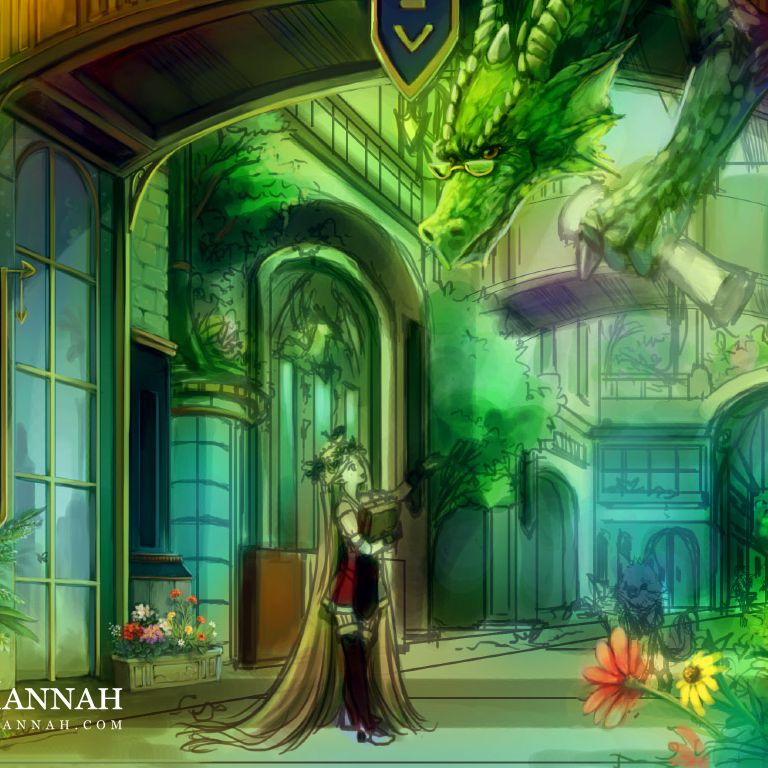
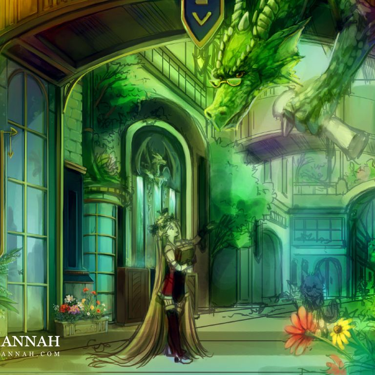
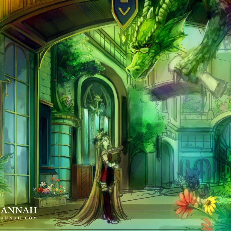
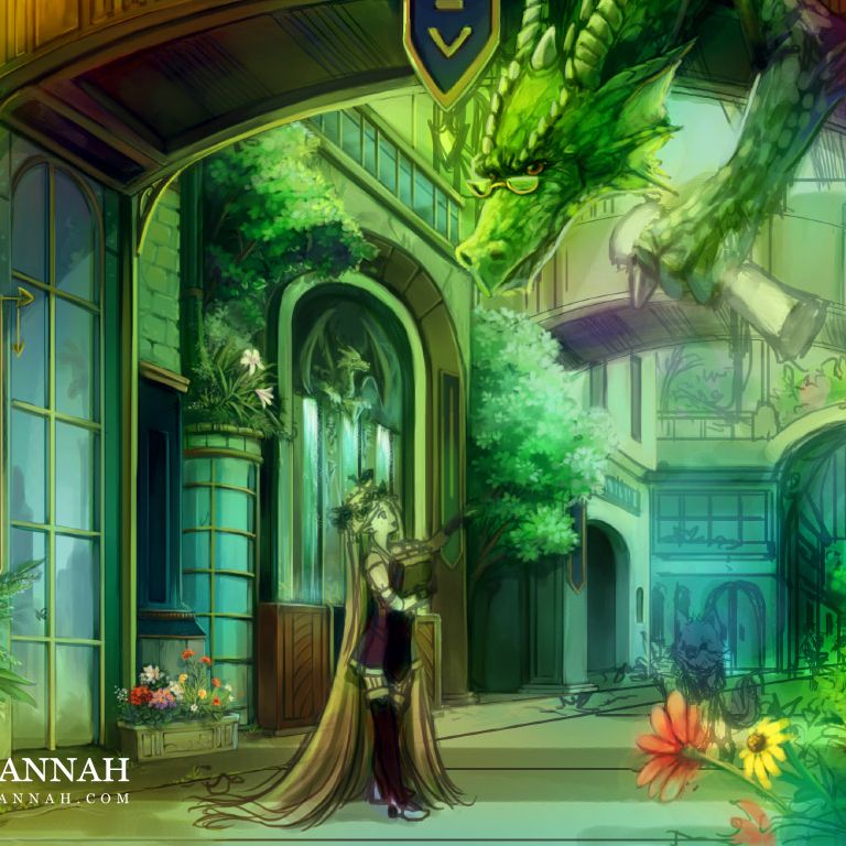
Girl
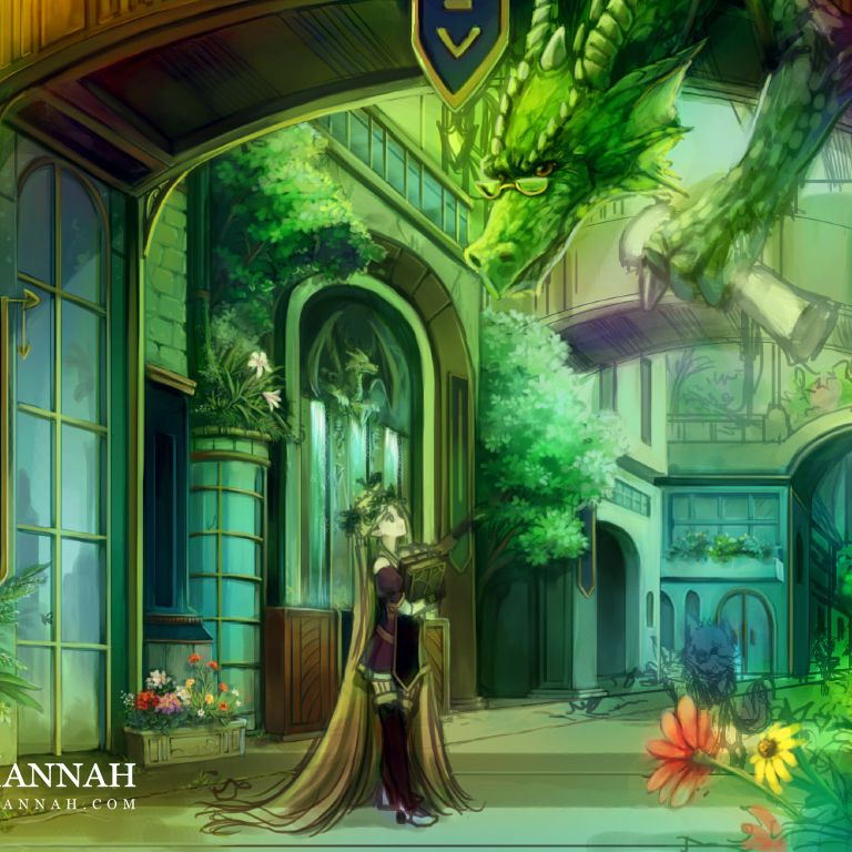
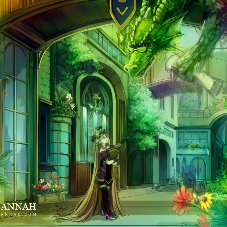
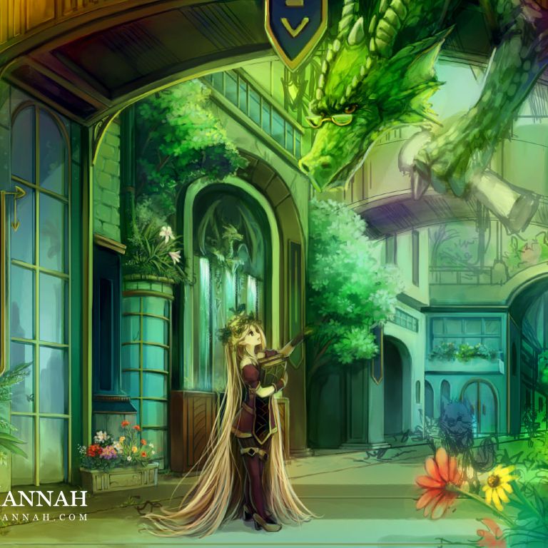
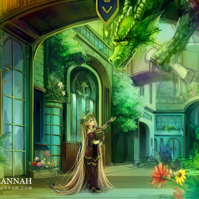
Tree
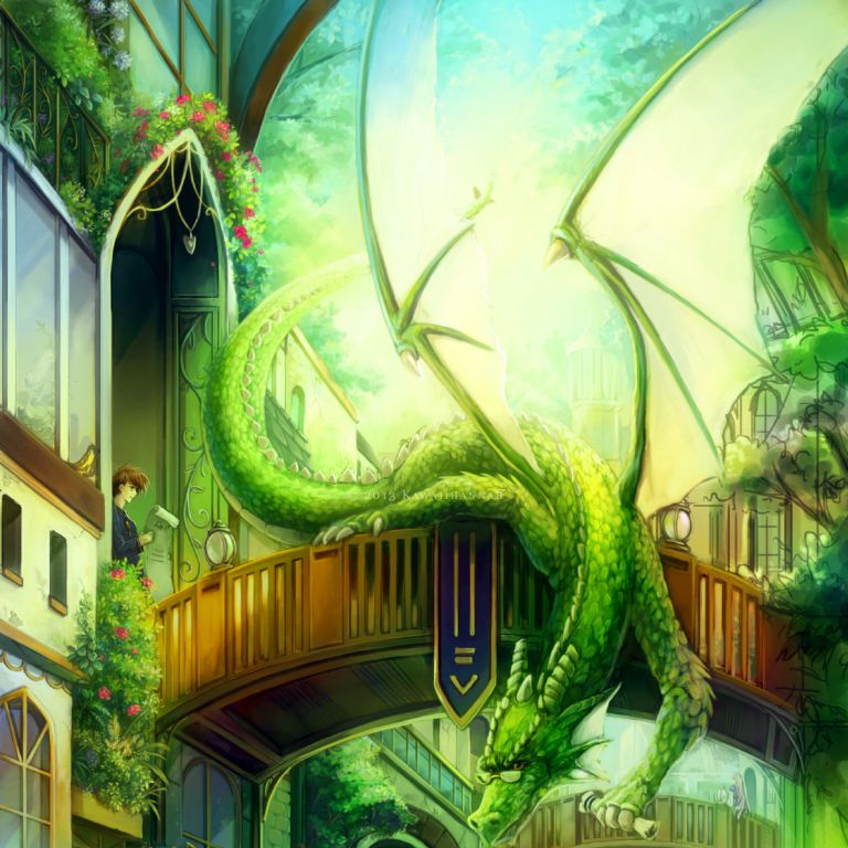
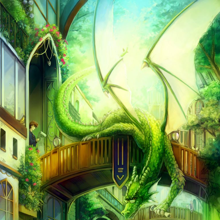


More Flowers
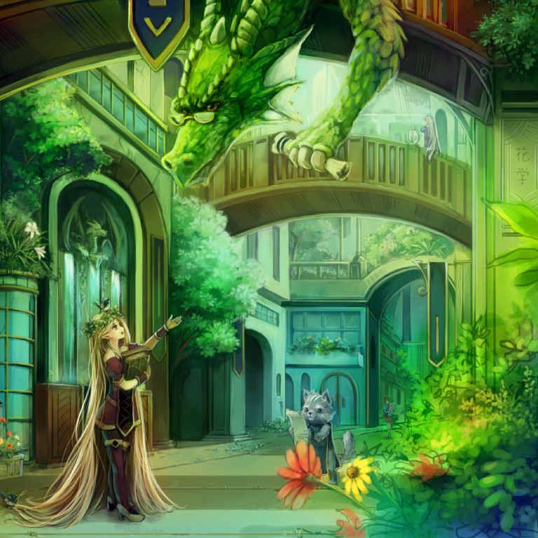
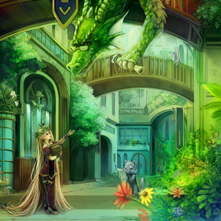

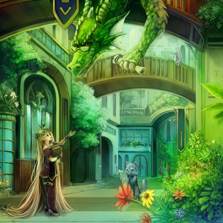
I’ve now finished the rendering process! XD
Final Touches
With the painting out of the way, I usually have some sort of final colour adjustment to do and then some tiny extras. In this case, some extra sunlight, small dots and a couple of little butterflies.
First, I make a copy of the entire picture (Copy Merged) and paste it onto a new layer. Then duplicate that layer (so there’s 2).
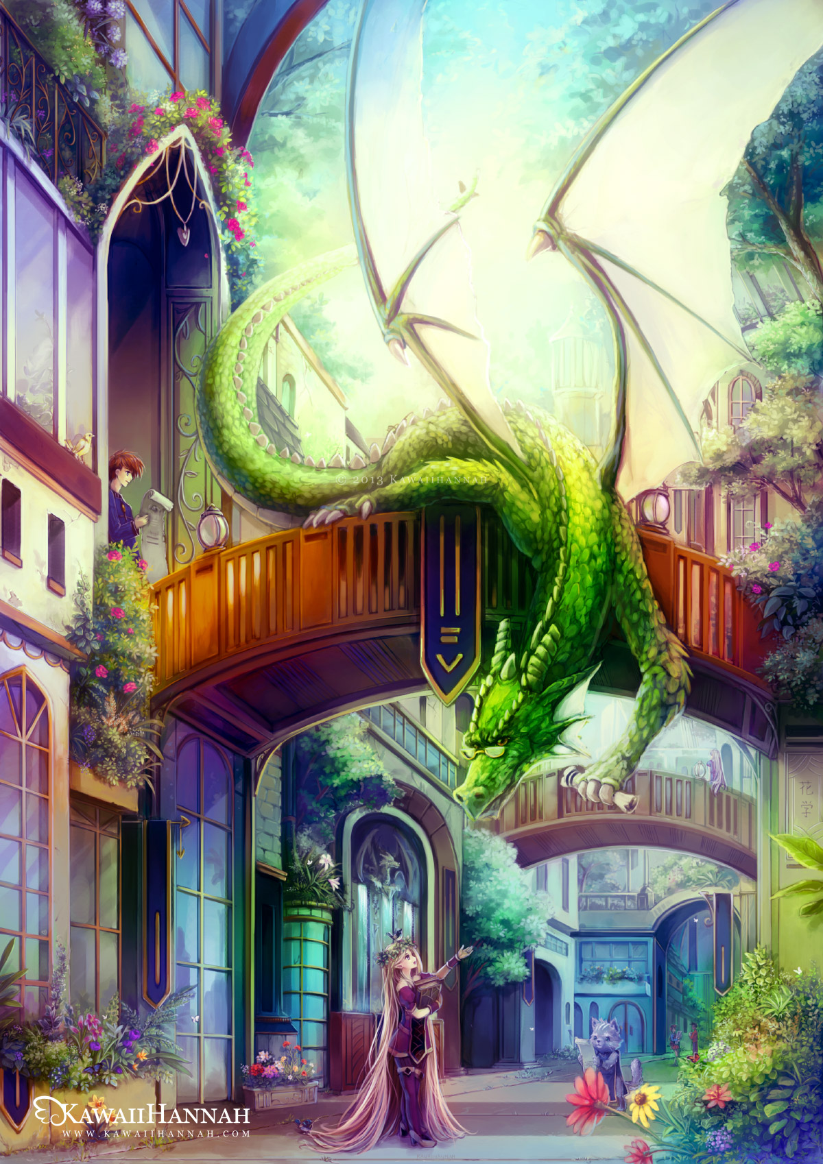
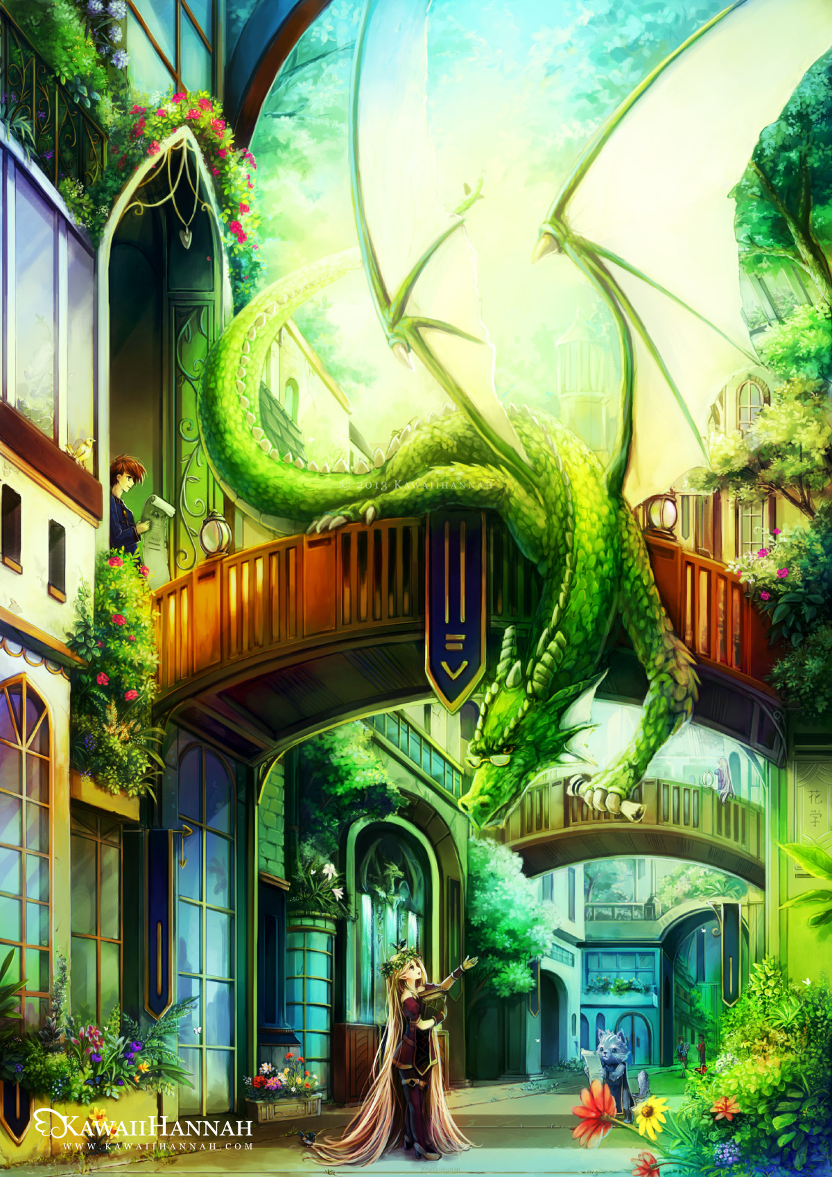
The first image shows the flat picture, just after painting. The second, I’ve adjusted the Colour Balance (of that second layer). Because the original painting is very green, I boosted the red tones and boosted the blue shadows.


The second layer that I adjusted, I set to “Overlay” mode. This usually makes the colours more vibrant and helps to add some contrast. In this case, it added quite a lot of contrast, so I masked some areas out, so details could still be seen on the underside of the bridge.
Lastly, I added a big layer of sunlight, so that it would separate the front bridge from the background and several little dots, using a small brush, set on scatter.
That’s it~
