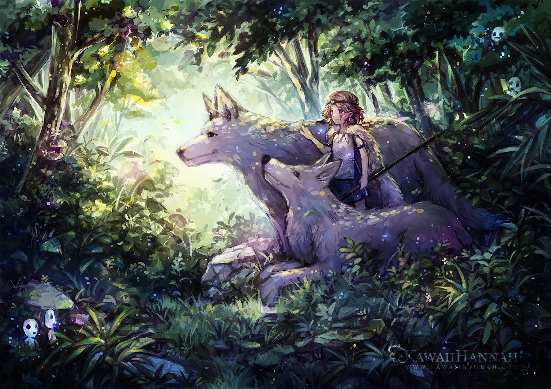
Mononoke Hime Walkthrough
The process of painting fanart of Princess Mononoke in Photoshop.
Simple walkthrough of the screenshots taken during the painting process of もののけ姫. I had a lot of fun painting this one, it has a lot of my favourite colours and the ambience came out as I hoped ^^
Initial concept
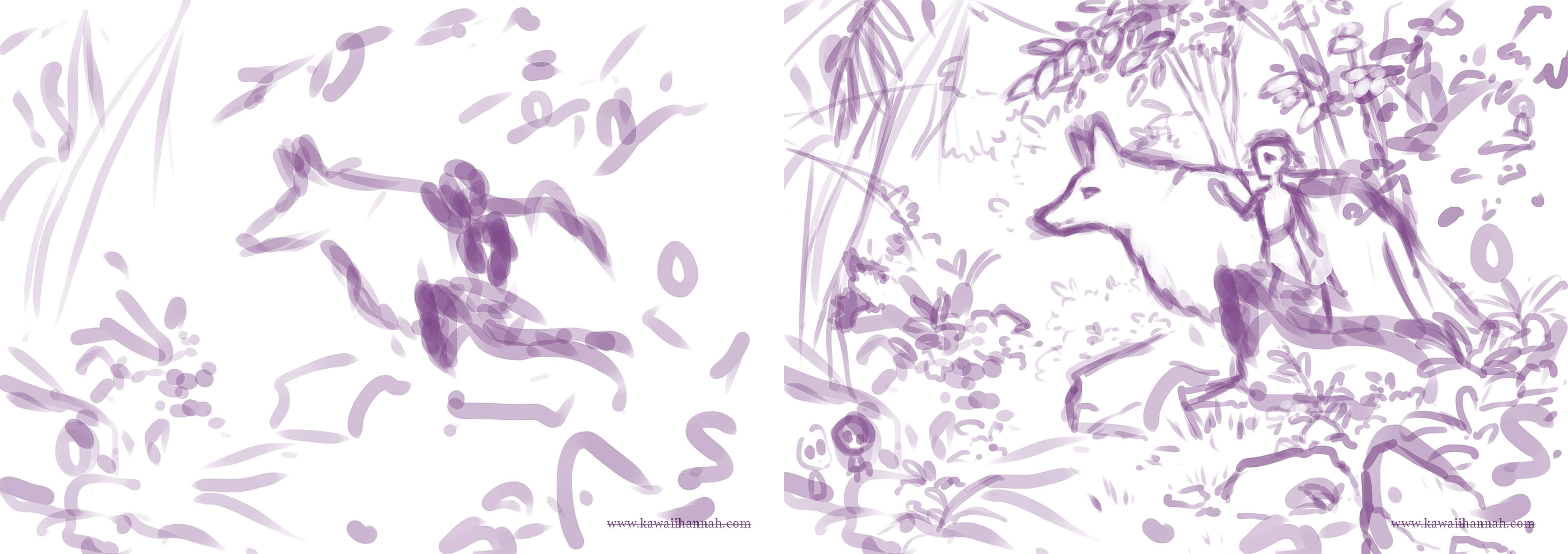
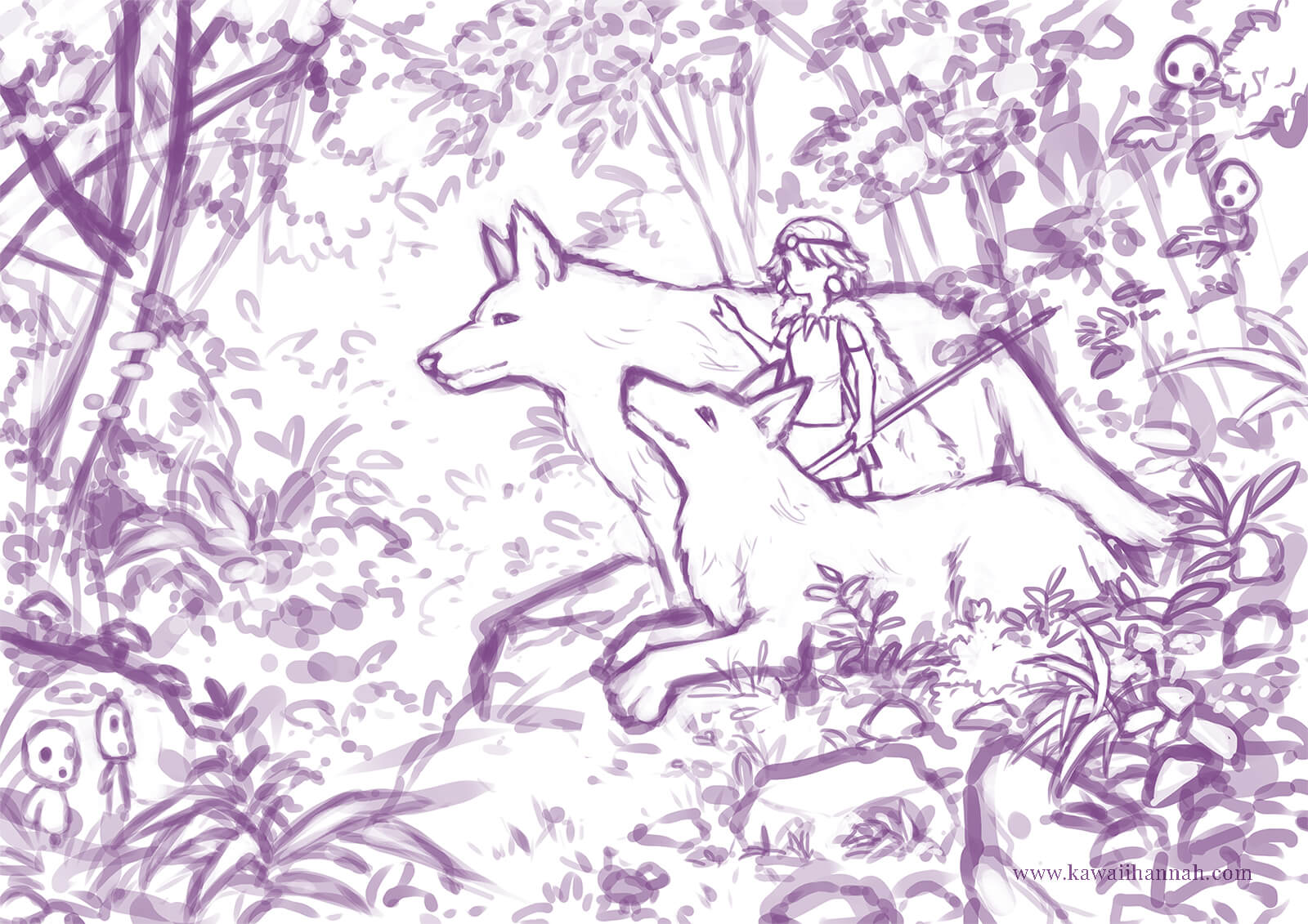
I’d been thinking about this one for a while and had a pretty good idea of what I wanted to draw, which…isn’t always the case. What is always the case though, is the hilarious beginning sketches that I have for any piece, that are little more than a scribble. You can see how it develops in the second step and the final sketch below.
Sometimes I get really impatient with this phase and start painting before things are defined – which can work too, but I find it’s usually easier if I stick it out and sketch things so the concept is a bit more obvious.
I’ve also started using a larger brush for sketching, so I’m not worried about lots of small sketchy lines. This is set so transfer is on, so it’s a little bit more watercoloury and transparent.
Colour and Mood
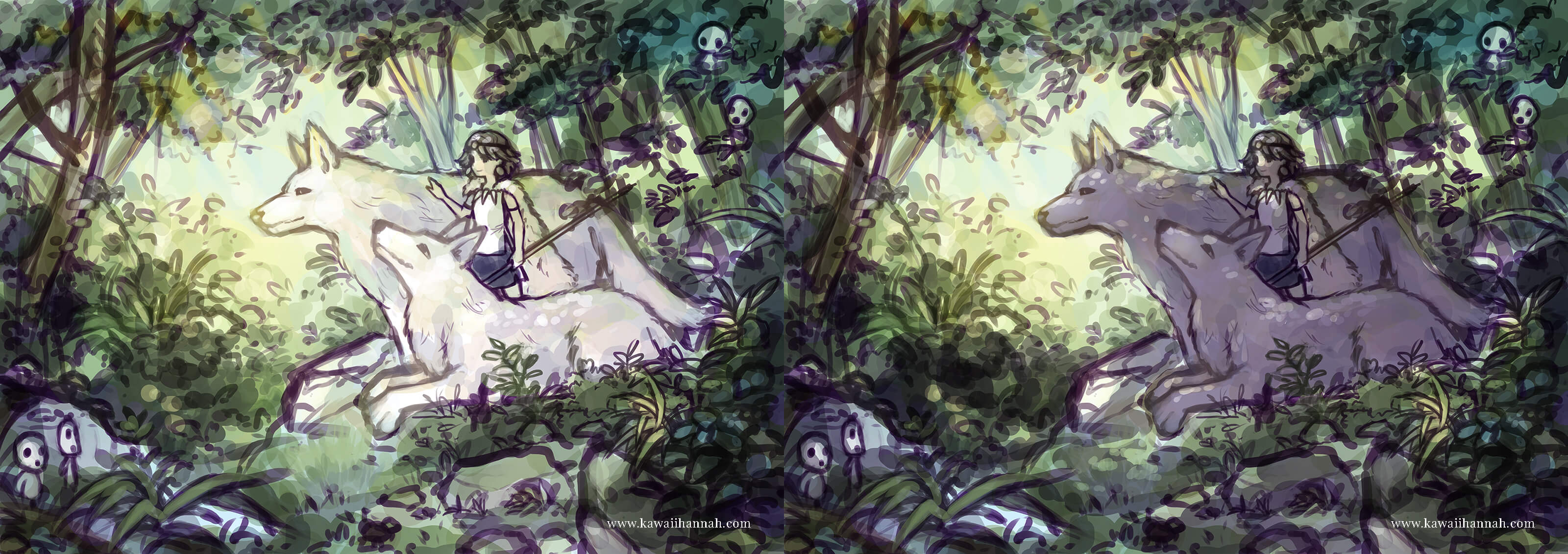
With a clear idea of this in mind, I set about adding green. Lots of green. I wanted a forest setting, that was somewhat dark, so the dappled sunlight could shine through in places. I also wanted it to feel peaceful, which is just something I like to draw (alongside green and leaves).
The first stages of this is always a bit of a challenge, trying to get the mood right and just layering things overtop until I get something that feels like it fits. I tend to use a few layers, either on multiply, or soft light to add subtle colours, or to darken some areas. Even though it starts off fairly desaturated, the colours get more saturated over time, which is what I like n_n
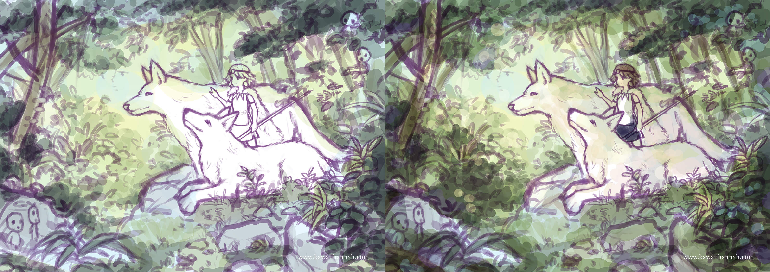
It looks like a big jump in the below steps, but there were two key things that were changed here. The sketch lines were set to multiply and made a darker colour and the main mood changing piece was adding another multiply layer and applying it to the characters. Putting them into shadow allows me to create those dappled effects that I wanted to and gives the scene more depth.
Rendering
Sky and Left Trees
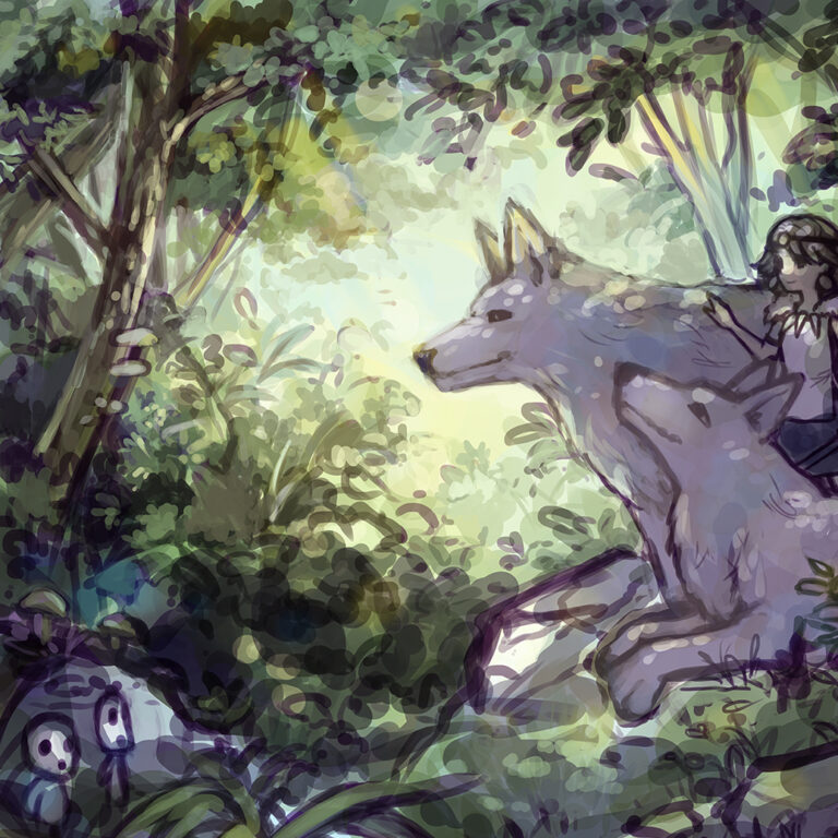
Started up in the top left, for no reason other than it’s the top left <_<
I enjoy painting leaves and I felt really out of practice, because I hadn’t done any digital painting in quite some time. So it was nice to just ease into it a bit. I start trying to hide some of the lines here as well, beginning to blend parts of the sketch in.
More Leaves
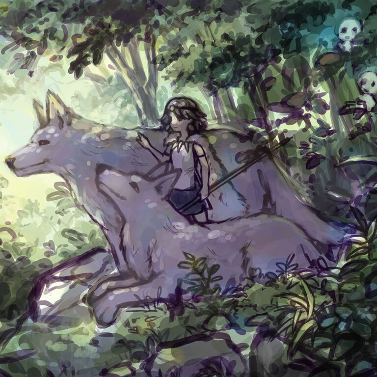
Aaand predictably, I moved towards the top right side of the image. Who’d have thought.
It did take a while, but I started to remember some of the backlighting of forms to help separate some of the areas of the leaves. I especially like using blue for this in shaded areas, or yellow (or light blue) in some of the areas where it’s lighter.
Characters
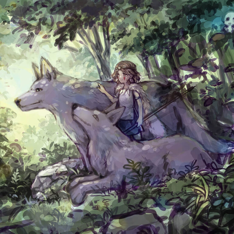
At a certain point I can’t fight the urge to give the characters a bit more definition.
I struggled a bit with this one, because while the characters are a focal point, adding a lot of details here is pointless, because you just can’t really see them in this scale. They just need to be recognisable enough, with roughly the right colours.
Dappled Sunlight!
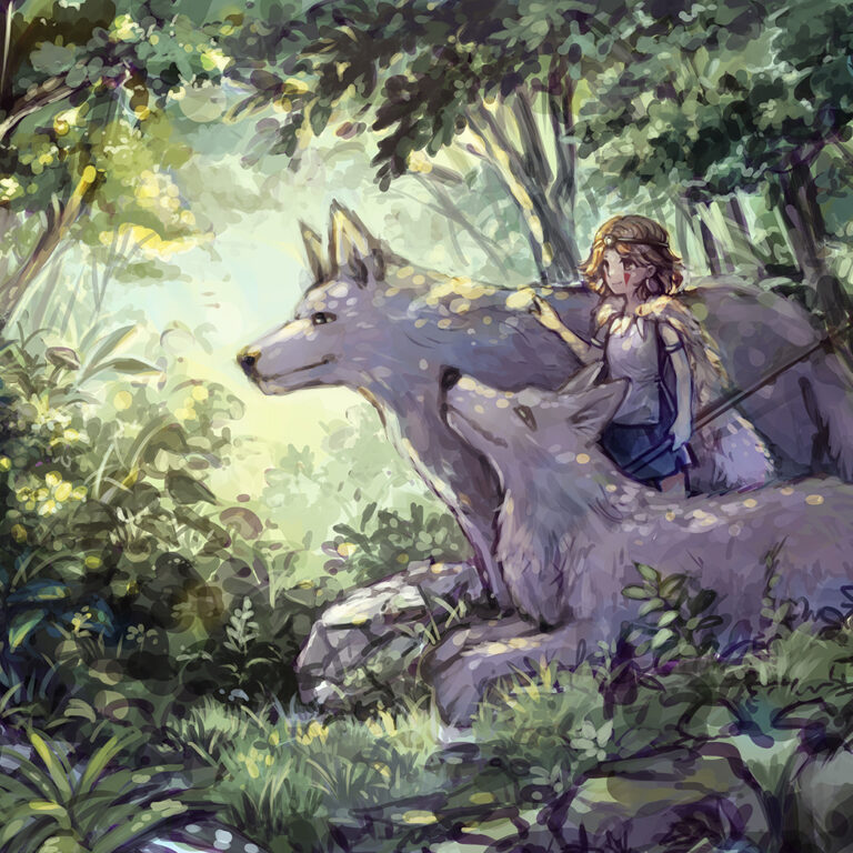
I was really looking forward to adding this – it was added using mostly yellow and on a mix of soft light and overlay layers. It gives it a lot more of a warmer feel, especially contrasted with the blue and purple within the shadows of the forest.
Had to keep this a bit limited, so that it would pop a bit more, rather than being overused and then losing impact.
Foreground and Details
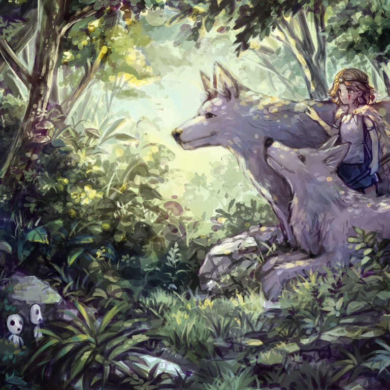
After taking a break for a week or two, I came back and went to rendering the foreground of the painting, rendering out the rocks, grass and plants.
There’s a mix of greens and blues here, so the plants have some sort of variation, including in the shape of the leaves. I think this could probably be improved further by using a forest reference.
Colour Adjustments
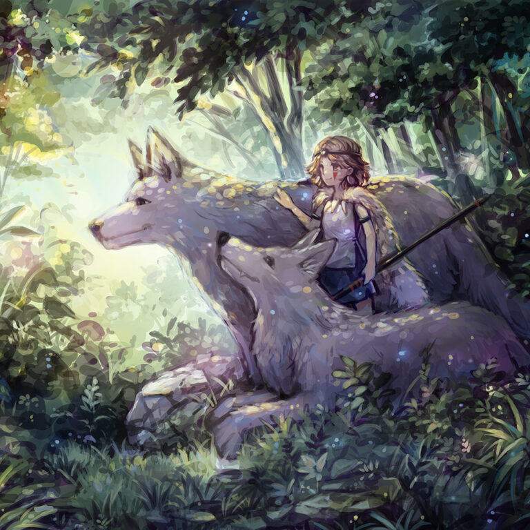
The rendering is mostly complete here and the image is mostly where I want the mood to be. I needed to boost the contrast a bit further, so a blue layer on soft light was added to give a bit more depth to the shadows again. Then some other spots of colour, in pink, yellow and blue for making parts of the foliage stand out better.
Finishing Touches
Added the last colour adjustments – boosting the blue a bit further and adding a few more glowy dots. Checked the contrast using a greyscale layer aaand that’s it.

