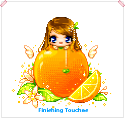
Basic Pixel Doll Tutorial
Drawing a basic pixel doll. This tutorial is from 2008.
In this tutorial, you’ll be able to see the principles learnt from the basic tutorial being used to create a pixel doll.
The base used in this tutorial is the Zephyr base – you can use another one if you like, but try to keep it small so that you can practice your pixel placement.
Picking your Idea
The most important part!
First you’ll need to come up with an idea of what to pixel, because all good things have to start somewhere. This will also make the entire process much easier as you’ll have a direction to go in. I’m going to pixel me with an orange! X3 You could try pixelling yourself with your favourite fruit ^^
Editing the Base
I want to pixel me holding on to the top of the orange…but there isn’t a pose for it in the Zephyr base set. So, I need to make one! ^^

All I need is the head from the Zephyr base, then to draw the arms, so it looks like it’s peering over the top of something.
I do allow editing of my bases. However, before editing someone else’s base, check their rules to make sure they allow it, or if they don’t mention it, email them to ask if it’s allowed ^^;
Drawing the Line Art
Initial Sketch
With the base done, I can now sketch out my idea ^_^ A sketch is very important as it will give you the size and composition of your piece. There’s nothing worse than spending hours pixelling something only to find it’s drawn on the wrong angle, or is the wrong size and you have to redo it x_x
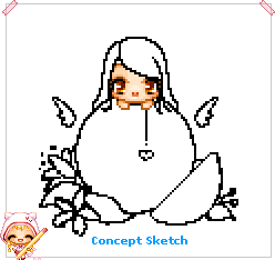
Here, you can see my sketch – I’ve got the orange, an orange segment and some leaves/flowers to garnish XP Make sure that your sketch isn’t too messy, it should be relatively clear which parts are which.
Refined Sketch
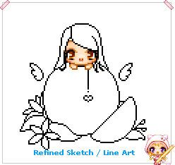
Here is my refined sketch – I’ve taken the sketch lines down to 1px in thickness, which gives me my final line art. This step is very important to have your final work look clean and tidy.
You should be able to see the principles from the basic tutorial clearly here – there are curves everywhere! o.o
Choosing Colours
My colours are pretty well chosen for me – they’ll be based around the orange I’ve drawn; warm, vibrant, citrus colours. So, orange, green, lemons and white ^_^
Flat Colours
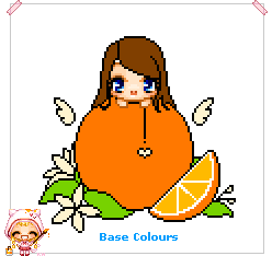
Here, you can see that I’ve filled the areas with a flat base colour, ready for shading later. Notice on the orange segment that I’ve separated the orange peel and inside flesh with colours, rather than using an outline – this is because adding outlines would separate the areas too much (and probably be too thick), making them look disconnected.
Colour theory is a bit too much to explain here >> But keeping to colours that are close to each other in the rainbow (like blue and purple, or yellow and green or red and orange) should keep your colours matching quite nicely.
Just don’t go with something like the default colour palettes in Paint of fluorescent green, fuchsia purple, and bright blue, I’ve seen it used a lot by beginners, and it hasn’t worked well at all @_@
Coloured Line Art
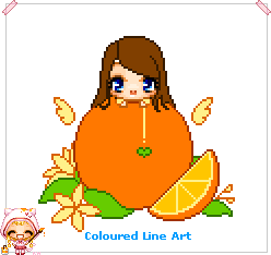
Having decided on the base colours, I coloured the outlines with a darker colour than the base colour inside it – dark green for the leaves, dark orange for the orange, peach for the flower outlines etc.
You can skip this step depending on the style you’re going for, but I find it blends things better later to give a nice overall finish ^_^
Lighting & Shadows
First of all, you’ll need to decide where the light is coming from – that way you’ll be able to figure out which parts get lots of light (highlights) and which parts don’t get light (shadows).
First Layer – Lighting
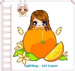
I’ve gone for a general light (like the sun) from the top left-ish corner – it’s probably the easiest to start learning with~
Now, I’m quite odd in my approach to shading – I do the opposite D: I prefer to do the lighting first and then add final shadows later if they’re needed, but you can add shadows first if you’d rather, whatever’s easiest ^^
Second Layer – Lighting

You should be able to see the orange starting to really take shape now as more layers of light are applied to it.
Notice the way the lighting is curved to help the orange look “spherical” in shape rather than flat. And also that it’s lighter more on the left side than the right because I decided the light was coming from the top left.
Also notice that details within the leaf have been further refined from the previous step and can be seen clearly now.
Third Layer – Lighting

This is the final layer of lighting now – compared with the two previous layers of lighting, this one is pretty mild, with most areas getting only a couple of pixels added. The orange itself gets the most attention for this lighting layer. Because of it’s size and it being so plain, I need to make sure that the lighting really brings out it’s spherical shape.
Fourth Layer – Shadows
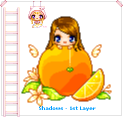
The first and only layer of shading (for me anyway – this might be your first layer of highlights if you started with the shadows) XP
Most areas don’t get much attention in this layer – the orange again gets the most attention, because it’s the biggest object XP I have however added a little shading to the part in the hair. I’ve also darkened the leaves hidden towards the back beside the orange, so they don’t stand out as much ^_^
Fifth Layer – Outlines
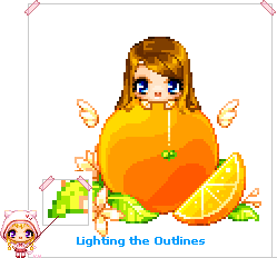
Now, I begin to shade and highlight the outlines using the shadow and base colours, to blend them into the image a bit. Be careful not to blend them too much, or they’ll disappear o.o
This process can be a bit tedious sometimes – I redid the outlines on the orange 3 times before I was happy with it ^^;
Dithering
You’ve probably noticed by now that my orange has very clear cut shading >> It’s good to start off that way, so you can get the shapes right, but leaving it looking like that would just look odd @_@
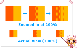
To solve the code orange problem, we can use dithering to smooth it out – we won’t have to use any more colours than we already have, dithering is all about pixel placement ^_^
There are only two colours used in the dithering example here. The grid-like patterns used effectively “trick” your eyes into seeing more colours than there actually are XD Dithering becomes very useful when you only have a limited colour palette to work with ^^
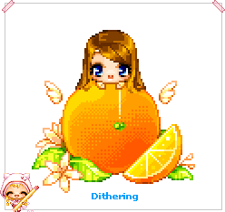
This took quite a while to actually dither, because of the curves, but I think the outcome is well worth the effort spent ^^
Thought I might mention it here – dithering is not necessary in all cases; I’ve seen a lot of people use dithering all over their pixel doll when it wasn’t necessary and the effect was that it looked washed out @_@ The majority of the pixel doll made in this tutorial hasn’t been dithered, just the orange, because it was needed there ^^
Finishing Touches
Lastly, the finishing touches. These are the small details that really lift your work off the screen ^^

Some of the things I’ve added are shadows under the hair and around the green heart, stamen to the flowers and drops of water onto the orange itself, as well as some little sparkly things scattered around.
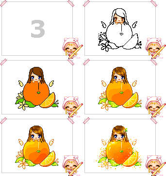
Add your signature to the final work, and that’s it! o.o Now let’s see it in animated magic ^0^
