Making a DeviantArt Icon
Making a 50x50px icon for DeviantArt. This tutorial is from 2010.
This tutorial was originally made in December 2007, but was only posted on my DeviantArt account. I’ve made small adaptations and expansions, but it is for the most part, the same.
Setting Up
Alrighty, we’re making an icon, anything you feel like drawing should do.
First you’ll need to come up with an idea of what to pixel, because all good things have to start somewhere. This will also make the entire process much easier as you’ll have a direction to go in. I’m going to pixel me with an orange! X3 You could try pixelling yourself with your favourite fruit ^^

Create a canvas that is 50×50 pixels and if you’re using a doll base, paste it in. You can copy and paste the box on the left for size if you need it X3
Sketch and Line Art
Sketch your idea onto the doll base using the 1px Pencil tool. Keep it simple. Pixels this size don’t have a lot of room for detail.
Don’t worry if you have a few stray pixels here and there – so long as you can see the general look.

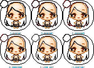
Next, clean up the stray pixels. The animation on the left shows the sketch, then the in between stage of tidying. The red pixels signify the pixels I consider to be “stray pixels”. Removing these pixels gives me the line art.
The idea is to have your lines 1px thick. It keeps it tidy and I find it gives a better finish at the end. So if you’re new to pixel art, don’t skip this step!
Zoom in and out as you go to check how the actual size of it looks.
Shading the Hair
Basic flat colouring. Some people prefer using outlines, some none, some use a mix of both.
When starting out, I recommend using outlines for hair, simply because it helps in keeping the hair shape. When I do use outlines, I make them darker than the flat hair colour.
Highlights
Note the halo-like shine on the top of the head and the shines are zig-zagy in shape. Often I apply highlights before shadows, but if you find it easier the other way around, go for it.
The third image is just extra shine – lather, rinse and repeat! It’s really just me liking to draw extra shiny hair XD
Shadows
I’ve add some shadows to define the bottom hair strands and halo-shine at the top.
In the second image I decided it as necessary to add another layer of shadows to further define the bottom strands and the part in the hair at the top.
Blending the Outlines
Now, we can blend the outline of the hair into the colouring we’ve finished, just enough so the outlines aren’t too defined.
I generally do this mostly around the highlights – compare the two cutouts (Steps 1 and 2) and you should be able to see the outline has been lightened where the highlights are.
Adding Hair Strands
I’ve added loose hair strands to make the hair look bouncy. Be careful where you place them, because adding too many may make the hair look messy…
Don’t forget to add shadows under the hair onto the base – the hair flows out from the head and casts a shadow underneath it.
And there’s an animated version at the left to show you the steps taken for the hair.
Clothes and Accessories
You should be getting the general idea now, we’ve already drawn the outlines, then we fill with a flat colour. With this sized pixel doll, it’s generally best not to draw folds in the line art.
Shading and Highlighting
Highlighting time! Use highlights and shadows to indicate folds on this sized doll. Make sure to keep it simple, so it doesn’t look messy when viewed at normal size.
On the second image, I have added some shadows to further define folds and blend the outline into the shadows and highlights – like shown earlier with the hair.
Adding Accessories
Add accessories such as hairclips, belts, shoes, whatever – careful not to add too much clutter~
If you’re wondering how to draw these things, they are done in the same way as the line art – sketch, flat colour, shade and highlight.
Finishing Up
Following the same steps as earlier, I have shaded, highlighted and blended the bottle ^_^ The shadows and highlights etc aren’t very consistent in placement in this case, but I’ve done it for the highlight noted below.
Because the bottle is made of glass, it needs to have extra shine on top. That extra shine makes it look like she’s stuck in there.
You can see I’ve added it in the form of a large white highlight on the top left where the light hits the bottle, as well as a reflective light around the inside of the outlines.
The Last Details
Add the last little bits of details! And that’s really it…
As you go, you’ll find that pixel art is just like drawing larger pieces, only that the space you have to work with is often much more limited.
Be sure to keep your outlines / shading / lighting quite simple and place your pixels carefully.
And most of all, have fun, because that’s what it’s really supposed to be about X3
