Shading & Lighting
Basics of shading and lighting for pixel art.
Lately I’ve had a lot of questions asking where to place shadows – the easiest way I’ve found is to show basic shapes and how they are applicable to what we want to draw.
Basic Shapes
When you’re not sure how to approach shading something, try breaking it down into smaller shapes.
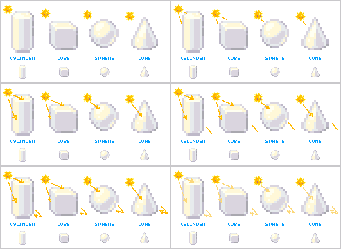
These are basic shapes that you’d often come across when doing early geometry XD But they’re not just useful in maths, they’re useful in drawing too!
Notice where the sun is placed and where the highlights and shadows fall.
The shapes of the highlight follow the shape or “form” of the object. Notice how the top of the cube has a very flat highlight, whereas the sphere has a curved highlight.
Highlights happen on the sides where the light hits it the strongest. There is also a small amount of light that bounces off the ground to hit the bottom, but it’s very small. The shadows are placed where the light can’t hit as much or at all.
Once you figure out where the light is coming from and how it will hit the shape you’re shading/lighting, the shadows become much easier to place ^_^
Tops Made of Cylinders
To show you a practical example, let’s look at a top.
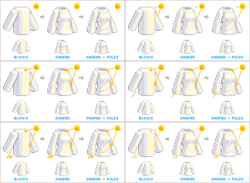
You can see above that I’ve built a very shapeless, impractical-looking, block top, but it’s made entirely of cylinders. Sleeves and the main part of the top are both quite cylindrical in their shapes, so from that, we can figure out where the shadows and lighting fall.
In the middle, I’ve simply edited the cylinders, adding and removing bits as a sculptor might. It’s still very blocky, but you can see how the contours of the shape have affected the shadows. If you look carefully though you can still see that the shadows and lighting still follow the basic cylinder placement.
Lastly I have added some folds, so the top doesn’t look quite so terrible XD When drawing pixel folds, you often have to define them with shadows or highlights (or both). Generally outlining folds is not needed, unless you’re working on a very large pixel doll and even then, it’s not very necessary.
Now that we’ve seen how to shade a top, we can apply it to an actual top.
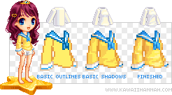
Looking here, you can see I haven’t made any outlines for folds. The first image has the basic shape of the top, outlined.
In the next step, I’ve followed the contours of the body underneath the top, as well as thought about some of the folds that will occur around the waist and elbows.
The last step shows the finished top, where I have finalised the shadows, making some darker and adding some subtle highlights in places. I have also anti-aliased the stripes on the cuff and neck.
Skirts made of Cones
When it comes down to it, a skirt generally can be broken into a cylinder, or a cone.
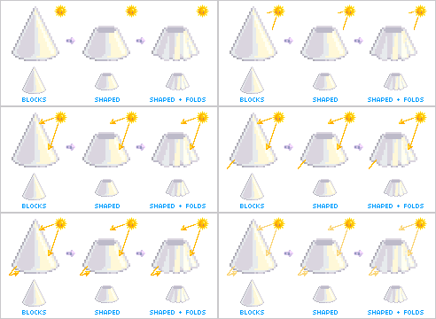
The first example shows very obviously just a single cone, which you can see has been lit from the right hand side XD
Second, I’ve begun shaping that cone (into what looks like a lamp-shade >_>) by cutting the top of it off.
Lastly, I’ve cut vertical pieces (extending to the tip of the cone) out of the shape. This shows the basics of skirt folds. These folds work almost like pieces of cones around the outside of the main cone.
Now, cones won’t work for every skirt – such as dealing with wind and body poses the shape can appear drastically different. But for the sake of simplicity, we’re dealing with a basic school-type skirt for this example.
Just like the top example, made of cylinders, we have the skirt made from a cone. You can see I’ve started with the basic shape, based on a cone, with the folds indicated.
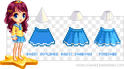
In the second example, I have placed the shadows in the same sort of places the cone has them placed, with some lighting on the right to show the folds better (I use lighting on the right to show the folds, because if I used the shadow colour there, it would be too dark).
Lastly, I’ve finished the skirt, darkening some shadow areas and adding light into others, as well as anti-aliasing the stripe along the bottom. When drawing patterns on clothing, don’t forget that they get affected by folds and shadows – in very dark shadows, they may look like they disappear~
Shoes and Socks
Can’t leave our poor model to go to school barefoot.
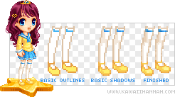
Anyway, from the previous sections, you should be able to see that the basic shapes used in the shoes and socks are cylinders. You could argue that the very front of the shoe has more of a sphere-like appearance, but, close-enough XP
The socks themselves are better thought of as made of 2 cylinders. Because they are so long, they cover both above the knee and below. So be sure to shade them individually and if the lighting works for it, add a shadow below the knee to indicate it’s still there.
Hair Made of Ribbons
Shading hair requires a slight change in thinking than just the basic shapes. I find hair easier to think of as chunks of “ribbon”. Pixel art is generally too small to draw individual strands, so I draw it in clumps.
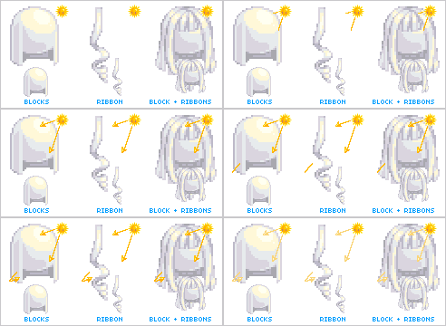
The first example there shows a very basic block shape for common medium-long hairstyles that aren’t tied up. This obviously isn’t much use outside of that style XD So, we can look to the middle example.
Here we’ve got a basic ribbon that is twisting and turning, or falling straight downwards (I figure this can be used as an example for drawing curls). Planting ribbons on the head gives us the 3rd example.
Now with those planted ribbons, we can see how the hair flows, or how it’s tied up and from that, we can figure out how to shade it. Unless it’s forced otherwise, the hair will usually follow the basic contours of the head, pushed downwards because of gravity. Because the head is round, we can safely work highlights and shadows to that sphere for the top of the head (this top shine, often ends up looking like a halo) and then work the “ribbons shadows” in from there.
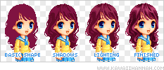
These are the basic steps I took to make the curly hair on our model. Nowadays I seldom outline hair when drawing it, but if you need to, go for it XD

The second example, you can see I’ve started adding some shadows – notice how there’s a large shadow on the left of the hair, because it’s flowing downwards and is out of the light there. There is also a big chunk of shadow behind her body and around the neck, where the hair is behind her. You should also be able to start seeing the ribbons of hair I’ve got that are sitting over top, such as at the very top of her head and also cascading downwards at the front.
The third example I’ve added a layer of lighting to further define and place things, following the ribbons and shapes set out previously.
The final example shows the finished hair. All that’s really been done here is darkening some shadows and lighting some highlights further, so that they stick out better. In this instance, making things darker sends it back, whereas lighter brings it to the front.
Aaand that’s it for this tutorial, for now anyway. Just remember to try breaking things down into basic shapes when you’re not sure what to do, and keep in mind where the light is coming from. It will become easier with practice, so just give it time ^_^ Thanks for reading~ <3
